In this article I will show you how to use Gauge Data Region in SSRS.
There are two types of gauges: radial and linear. The following illustration shows the basic elements of a single radial gauge in the gauge panel.

First of all create table named as TopFootballPlayers in Database and insert some data as in following script. You will find the script on below link :
1. Now open Visual Studio 2010 and open your SSRS project. Then add report named as DemoGaugeReport in your project.
Now create a Dataset. In the dataset, we will use following query.
1
2
3
| SELECT *FROM TOPFOOTBALLPLAYERSWHERE NO = @RANK |
2. Right click on report area and go to Insert–>Gauge.

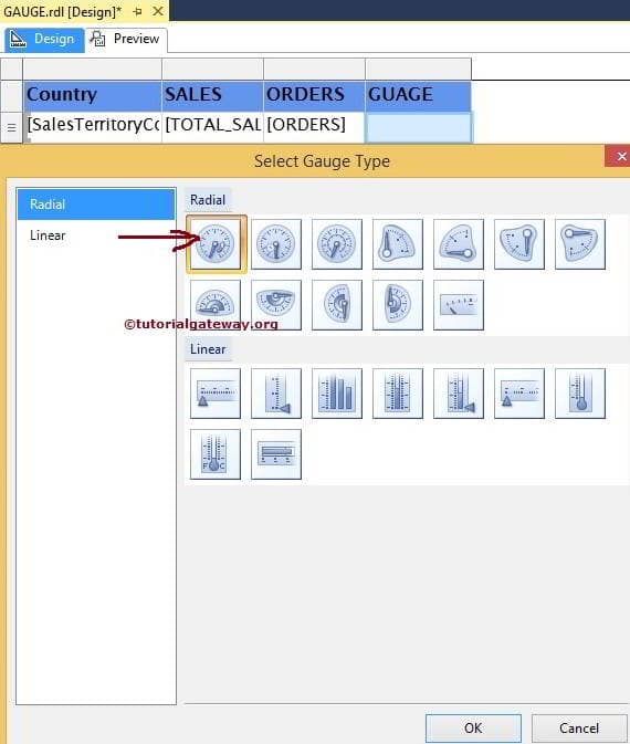
3. A Select Gauge Type window opens. In that select Radial from left Pane & Select Radial from it. Then click on OK button.

4. Now your report design look like below screenshot.

5. Then click on Pointer & select InternationalGoals as shown in below screenshot.

6. Then right click on Scale & select Scale Properties as shown in below screenshot.

7. A Radial Scale Properties window opens. In that modify values of Minimum, Maximum & Interval as shown in below screenshot. Then click on OK button.

8. Then right click on Range & select Range Properties.

9. A Radial Scale Range Properties window opens. In that modify values of Start Range & End Range as shown in below screenshot. Then click on OK button.

10. Now drag & drop one text-box from toolbox and add it above gauge chart. In text-box add text Goals of and data field PlayerName as shown in below screen.

You can also modify appearance of scale, pointer, range, pointer cap etc.
11. So we have done with the Gauge Report. To see the results click on preview tab.

Congratulations! We successfully completed Gauge Report in SSRS.


Note: We have changed the Gauge pointer color to red for better visibility

III. Now drag and drop the gauge into new column.


So we have implemented Gauge successfully. Report is showing Gauge indicator correctly.
1. Background
This article describes how to implement Gauge data region in the report. Many Dashboard and Score Card reports require colorful indicators to show quantity, population, productivity etc. Gauge is one of popular data region of reporting services that acts like a measuring instrument in the report. It makes report more interactive and helps the business users to understand the data more easily.
2. What is Gauge Data Region?
The Gauge data region is a one-dimensional data region that displays a single value in your dataset. We can use gauges to perform many tasks in a report:
· Display key performance indicators (KPIs) in a single radial or linear gauge.
· Place a gauge inside a table or matrix to illustrate values inside each cell.
· Use multiple gauges in a single gauge panel to compare data between fields.
There are two types of gauges: radial and linear.
Radial Gauge:
Linear Gauge:
3. Steps to implement Gauge data region into report:
Below is the simple report in which we will add Gauge data region for population data:

I. Here we will add Gauge for the city population to the right side of the Population column. For adding a new column, right click on the Population column then Insert column and select Right. It will insert a new column right to Population column.

Newly Added column is shown below:

II. Right click on the report plan, click on Insert and select Gauge:

III. Select a Radial Gauge. It will insert the gauge data region:
Here we can see the gauge data region in the report layout:

IV. Double click on the Gauge and map gauge data to City_Population column of the
dataset:

V. Below screenshot showing Gauge mapped to City Population.

VI. We can adjust the scale range based on our data. Here we are working on population data and all the cities in report having more than 2 lakh records. So setting the Below scale range:
Minimum: 200000 and Maximum: 15000000
For adjusting the scale range, right click on the Gauge Scale and click on Scale properties:
Note: We have changed the Gauge pointer color to red for better visibility
Below is the screenshot for Radial scale properties:


IV. Give some name to new column e.g Population Indicator. So final Report layout looks like below screenshot:

V. Preview the report and see whether Report is showing Gauge Indicator with respect to city population or not:

4. Conclusion
By using the above steps, we can implement gauge data region in the report to make report more interactive that is very helpful for users to analyse the data easily.
----------------------------------------------------End of Document---------------------------------------------------


Gauges in SSRS 2014
by suresh
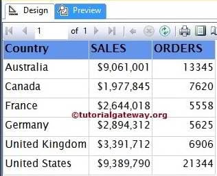
In this article we will show you, How to create and configure the Gauges in SQL Server Reporting Services 2014. For this, We are going to use below shown report. Please refer SSRS Table Report, Data Source and Dataset articles to understand the creation of Data Source, Dataset and Table report. If you observe the below screenshot, It was a normal Table report with Country Name, Sales and Total Number of Orders columns.
We used the Embedded Dataset for the above report and the SQL Command we used as theDataset is:
1
2
3
4
5
6
7
8
9
|
SELECT [SalesTerritoryCountry]
,SUM ([OrderQuantity])AS ORDERS
,SUM ([SalesAmount])AS [TOTAL SALES]
FROM [DimSalesTerritory]
INNER JOIN FactInternetSales ON
[DimSalesTerritory].SalesTerritoryKey = FactInternetSales.SalesTerritoryKey
GROUP BY [SalesTerritoryCountry]
ORDER BY [SalesTerritoryCountry]
|
Creating Gauges in SSRS 2014
In this example, We will create and add the Gauges on the right hand side of the Orders column So, First create an Empty column by right clicking on the Orders column and select the Insert Column option and then select Right option.
Next, Drag and drop the Drop the Gauges from Toolbox to Empty column. When you drag and Drop the Gauges from Toolbox to Empty column, a new window called Select Gauges Type will be opened to select required Gauges (Radial and Linear) from the available once. In this example, we are selecting Simple Radial Gauges as shown in below screenshot.
Click Ok to add Radial Gauge to newly created empty cell. Now, we have to configure the Gauges value. First, Click on the Gauges will open the Gauge Data window. In this example, we want to show the Radial Pointer for Orders so, Please drag and drop or select the orders as the Indicator Value.

NOTE: Please be careful when dragging the columns to values region, if you mishandled or dropped in design area will end up in mess.
Next we have to configure the Scale Properties of a Gauge so, Right Click on the Scale will open the context menu. Please select the Scale Properties option from it.

Once you select the Scale Properties option, a new window will be opened to configure the Gauge Scale. From the General tab, you can notice the default Minimum and Maximum values of a Radial gauge scale.
By default, The Minimum and maximum values of the Radial Scale will be between 0 and 100. Here, we are leaving the minimum value to 0 and maximum value to 25000. You also use the fx button for custom expressions.

NOTE: You can also customize the intervals between Minimum and Maximum value using the Interval property.
Click Ok to finish configuring the Radial Gauge properties. Lets see the Report preview by clicking on preview tab
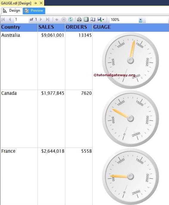
We successfully created the basic Radial Gauge
Adding Range to Gauges in SSRS 2014
If you observe the speed meter of a Car or Bike, you can see the Green, Red and Default White colors inside the Radial Gauge and each color has the meaning. If you want to apply the same in SSRS Reports then you can use the Range property in gauges.
To add the Range, Right Click on the Scale will open the context menu. Please select the Add Range option from it as shown in below screenshot.
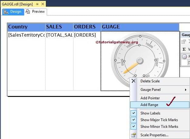
Next, we have to configure the range properties by right clicking on the range and selectingRange Properties.. option
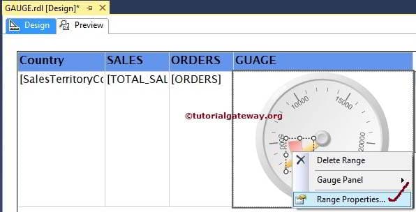
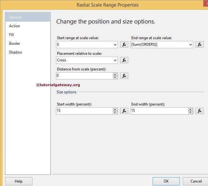
Once you select the Range Properties.. option, a new window called Radial Scale Range Properties will be opened to configure the Range scale.
- Start range at Scale Value: Default value is 250, it means range will start at 250 but you can change as per the requirements.
- End range at Scale Value: By default 5000, it means range will End at 5000 but you can change as per the requirements.
- Placement relative to scale: Here you have to decide whether you want to place the range inside the scale or outside the scale or across the scale.
- Start width: Range width at the starting position. By default 15 but you can change as per the requirements.
- End width: Range width at the ending position. By default 30 but you can change as per the requirements.

In this example, we changed the starting position to 0 and end position to Sum(Orders). It means, Range will start at 0 and finish at Sum(Orders) value.
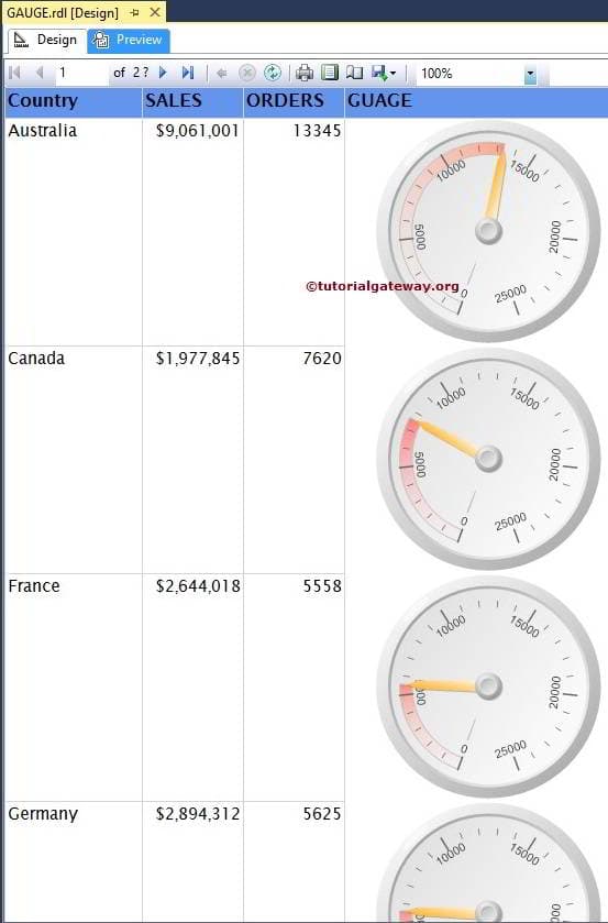
Click Ok to finish configuring the Range properties of a Radial range. Lets see the Report preview by clicking on preview tab
Thank you For Visiting Our Blog
Linear Gauges in SSRS 2014
by suresh
In this article we will show you, How to create and configure the Linear Gauges in SQL Server Reporting Services 2014. For this, We are going to use below shown report. Please refer SSRS Table Report, Data Source and Dataset articles to understand the creation of Data Source, Dataset and Table report. If you observe the below screenshot, It was a normal Table report with Country Name, Sales and Number of Orders columns.
We used the Embedded Dataset for the above report and the SQL Command we used as theDataset is:
1
2
3
4
5
6
7
8
9
|
SELECT [SalesTerritoryCountry]
,SUM ([OrderQuantity])AS ORDERS
,SUM ([SalesAmount])AS [TOTAL SALES]
FROM [DimSalesTerritory]
INNER JOIN FactInternetSales ON
[DimSalesTerritory].SalesTerritoryKey = FactInternetSales.SalesTerritoryKey
GROUP BY [SalesTerritoryCountry]
ORDER BY [SalesTerritoryCountry]
|
Creating Linear Gauges in SSRS 2014
In this example, We will create and add the Linear Gauges on the right hand side of the Orders column So, First create an Empty column by right clicking on the Orders column and select the Insert Column option and then select Right option.
Next, Drag and drop the Drop the Gauges from Toolbox to Empty column. When you drag and Drop the Gauges from Toolbox to Empty column, a new window called Select Gauges Type will be opened to select required Gauges (Radial and Linear) from the available once. In this example, we are selecting Simple Linear Gauges as shown in below screenshot.

Click Ok to add Linear Gauge to newly created empty cell. Now, we have to configure the Gauges Data. First, Click on the Linear Gauge will open the Gauge Data window. In this example, we want to show the Linear Pointer for Total Sales so, Please drag and drop or select the orders as the Indicator Value.

NOTE: Please be careful when dragging the columns to values region, if you mishandled or dropped in design area will end up in mess.
Range Properties in Linear Gauges in SSRS 2014
If you observe the above screenshot, Range is starting at 60 (Middle of the Scale) and end at 100. Let us make it more meaningful by Right Click on the Range will open the context menu. Please select the Range Properties.. option from it as shown in below screenshot. To add the Range, Please refer Adding Ranges section in Gauges in SSRS 2014 article.

Once you select the Range Properties.. option, a new window called Linear Scale Range Properties will be opened to configure the Range scale. We are already explained the properties and their Default values of a Range in Gauges article.
Here, we kept the starting position to 0 and are changing end position to Sum (Total Sales). It means, Range will start at 0 and finish at Sum of Total Sales of each individual Territory.

Linear Gauge Scale Properties
Next we have to configure the Scale Properties of a Linear Gauge so, Right Click on the Scale will open the context menu. Please select the Scale Properties option from it.

Once you select the Scale Properties option, a new window will be opened to configure the Linear Gauge Scale. From the General tab, you can notice the default Minimum and Maximum values of a Linear gauge scale.
Here, we are changing the minimum value to 1500000 and maximum value to 9500000 because our values are between these two values. You also use the fx button for custom expressions.

NOTE: You can also customize the intervals between Minimum and Maximum value using the Interval property.
Next, We formatted the Number to currency, removed the decimal values and asked the reporting server to display values in thousands. It means 1500000 will be displayed as $1500

Click Ok to finish configuring the Linear gauge properties. Lets see the Report preview by clicking on preview tab

If you observe the above screenshot, It is giving perfect result but the range is starting beyond the starting point (1500000). This is because, We set the Range Starting value to 0 at the beginning. Let us change the range starting value to 1500000 as shown below

Click Ok to finish and click on preview tab

If you observe the above screenshot, It looks neat and clean.
Thank you For Visiting Our Blog
Formatting Gauges in SSRS 2014
by suresh
In this article we will show you, How to Change the Gauge color, Gauge Frame, Gauge Pointers and formatting Range properties in SQL Server Reporting Services 2014 with example.
To explain the available Format options, We are going to use below shown report. Please refer Gauges in SSRS article to understand the Data Source and Dataset we used for this report.
Formatting Gauge Properties
First, Right-click on the Gauge will open the context menu as shown in below screenshot. Please select the Gauge Properties.. option from that menu

Format Gauge color (Dial Color)
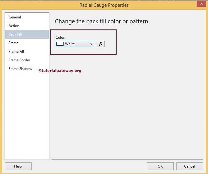
Once you click the Gauge Properties.. option, a new window will be opened to format the Radial Gauges. From the below screenshot you can observe that, By default Gauge is filled with White Smoke color but For now, we selected the white color. Please click on the fx button to write the custom expression for color.
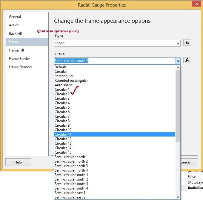
Format Gauge Shape
Within the Radial Gauge Properties window, If you click on the Frame Tab we have multiple shapes to choose as shown below. Here we stick to the default Circular 2 but you try your own.
Format Frame Color of a Gauge
If you click on the Frame Fill Tab we have the default Frame color, Please change as per your requirement. Here we are selecting Cornflower Blue color as Frame Color.

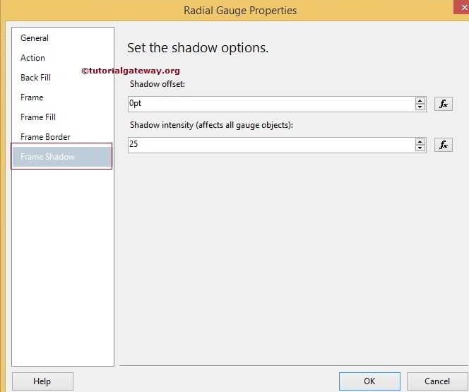
If you want to set the shadow effects to the Gauge Frame then please provide the details inFrame Shadow Tab as shown below
Formatting Gauge Pointer
First, Right-click on the Gauge Pointer will open the context menu as shown in below screenshot. Please select the Pointer Properties.. option from that menu

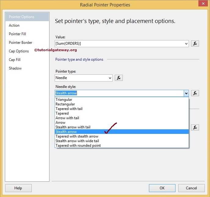
Changing Gauge Pointer
Once you click the Pointer Properties.. option, a new window will be opened to format the Radial Gauge Pointer. Please change the Pointer type and Needle style as per your requirement. In this example, We are changing the Needle Style to Stealth Arrow as shown in below screenshot
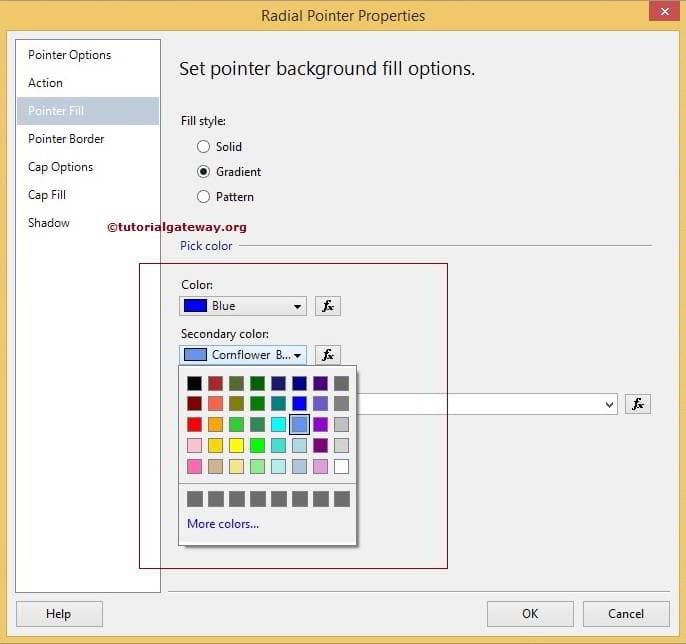
Format Pointer Color of a Gauge
Within the Radial Pointer Properties tab, If you click on the Pointer Fill Tab we have the default pointer color and Style, Please change as per your requirement. Here we are selecting Primary color to Blue and Secondary color to Cornflower Blue color as shown below.
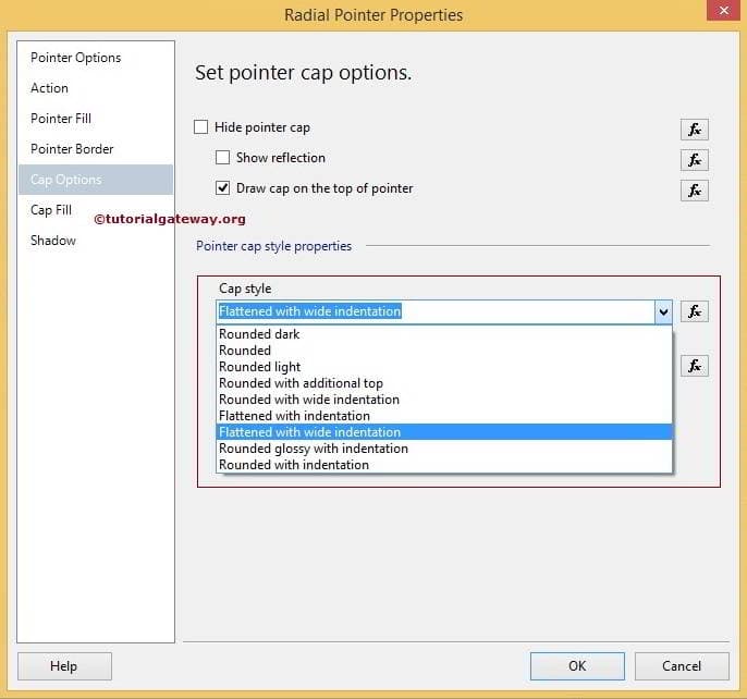
Format Pointer Cap of a Gauge
Within the Radial Pointer Properties tab, If you click on the Cap Options Tab we have the options to Hide the Pointer Cap and change the default Cap Style, Please change as per your requirement. Here we are selecting Flattened with wide indentation as the Pointer Cap Style as shown below.
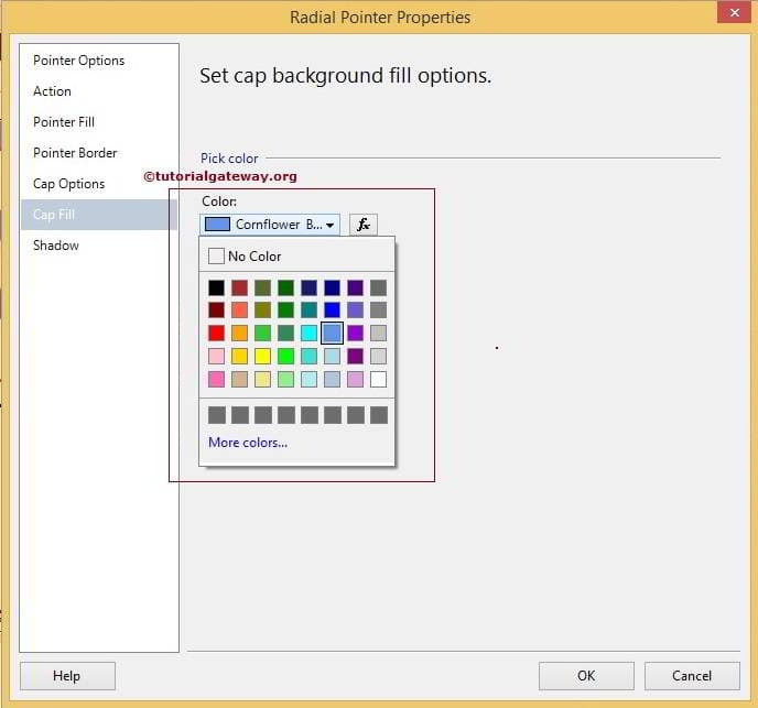
Format Cap Color of a Gauge
Within the Radial Pointer Properties tab, If you click on the Cap Fill Tab we have the default cap color, Please change as per your requirement. Here we are selecting Cornflower Blue color as shown below.
Formatting Range Properties of a Gauge
First, Right-click on the Range will open the context menu as shown in below screenshot. Please select the Range Properties.. option from that menu

Format Range Colors in Gauges
Once you click the Range Properties.. option, a new window will be opened to format the Range of a Radial Gauge. First, goto Fill tab, you can notice the default colors and styles of a Range, Please change as per your requirement. Here we are selecting Primary color as Light Steel Blue and Secondary color to Cornflower Blue color as shown below screenshot.
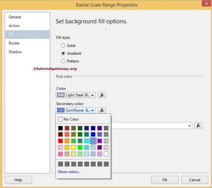
NOTE: By clicking the fx you can customize the colors using Expression
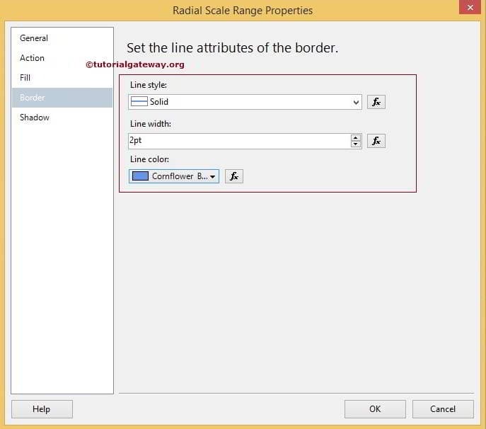
Format Range Borders in Gauges
Within the Radial Pointer Properties tab, If you click on the Border Tab we have the default Line Style, Line Width and Line Color. Here we are selecting Cornflower Blue color as Line Color, Width as 2pt shown below.
Format Scale Properties of a Gauge
First, Right-click on the Scale will open the context menu as shown in below screenshot. Please select the Scale Properties.. option from that menu. Once you click the Scale Properties.. option, a new window will be opened to format the Scale of a Radial Gauge. First, goto Labels tab, you can notice the default configurations of a labels. Here you can Hide or Show the labels and also change the positions etc as shown below screenshot.

Changing Font Style and Font Size in Gauge in SSRS 2014
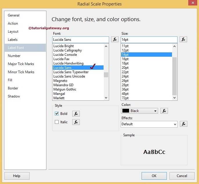
Within the Radial Scale Properties window, goto Label Font tab and style the font as per your requirements. In this example we are changing the Font to Lucida Sans, style to Bold and Color to Black
Formatting Scale Numbers in Gauges
Within the Numbers Tab, you can change the Number format to Number or Currency or Percentage. In this example, we are removing extra decimals.

Click Ok to finish formatting the Gauges. Let us see the report preview by clicking Preview tab

Thank You for Visiting Our Blog