In this article, I will show you how to use Data Bar in SSRS Report.
1. First of all create table named as TopFootballPlayers in Database and insert some data as in following script. You will find the script on below link :
2. Now open Visual Studio 2010 and open your SSRS project. Then add report named as DemoDatabar in your project. Now create a Dataset. In the dataset, we will use following query :
1
2
3
| SELECT * FROM TOPFOOTBALLPLAYERSORDER BY PLAYERNAME |
3. Now right click on report area and go to Insert–>Table. Then select data fields as a column in table. After that your Report Design will look like below.

4. Then right click on 3rd column and insert columns on right side.

5. Now right click on 4th column and select Insert –> Data Bar.

Alternatively you can also drag & drop Data Bar from Toolbox also.

6. A Select Data Bar Type window opens. In that select Data Bar from Left Pane and then Select Bar as Shown in below screen. Then click on OK button.

7. Now your report design looks like below :

8. Now click on Data Bar & select International Goals as shown in below screen :

9. So we have done with Data Bar in SSRS Report. To see the preview click on Preview Tab. You will see results like below :

10. If you want to see Data Bar in Reverse Direction, It is very easy.Right click on Data Bar & Select Horizontal Axis Properties.

11. In that Window Check checkbox of Reverse direction. Then click on OK button.

12. To see the results click on preview tab, You will see results like below :

13. If you want to show data labels , right click on Data Bar & select Show Data Labels.

14. Click on preview tab to see the results.

Congratulations! We successfully completed Data Bar in SSRS Report.


1. Background
The aim of the article is to describe a way of adding data bars in the report to make report more interactive.
2. What is Data bar?
- Data bars are small, simple charts that convey a lot of information in a little space.
- Data bars are often used in table and matrices.
- Data bars can represent multiple data points, but typically illustrate only one.
- Data bars usually depict single value in a cell.
- We cannot add a data bars to a detail group in a table.
- Data bars do not have any category group. It will have only series grouping.
Types of Data bars:
3. Steps to add the Data bar in the report:
Below is the sample Sales report which shows year wise sales amount for various regions:
We will add data bars into the above report to show year wise sales amount for regions.
I. Go to report layout and remove FiscalYear column from the tablix:
After deleting column, report is having only two columns:
II. Preview the report:
Here we can see that Sales Region is repeating as we have deleted the fiscal year column so we can group the data by Sales Region to avoid duplicate records.
III. To create a group for SalesRegion, click on Details group in Row Group pane and select Group Properties:
IV. It will show the Group Properties:
V. Click on “Add” button and select “Sales Region” and click Ok:
VI. Now go to tablix and right click on SalesAmount text box and select expression:
VII. It will open the expression builder, add the SUM function to sales Amount:
=SUM(Fields!SalesAmount.Value)
Click Ok.
VIII. Preview the report. It will show the aggregated Sales Amount for SalesRegion:
Now we can see the report showing region wise aggregated Sales Amount.
Note: Now we will add the data bars to show progress of Sales Amount.
IX. For adding Data bar, right click on Report layout then Insert and select Data bar:
X. Select the data bar type:
It will show the Data bar in the report layout:
XI. Set the property for Data bar:
· Value – SalesAmount
· Series – Not required
· Category Group – Not required because we already grouped data into tablix by Sales Region
XII. Now add a new column into a tablix named SalesIndicator. Drag and drop the Data bar into this newly created column:
XIII. Now report layout looks like below one:
XIV. Now run the report and see whether we are able to see the sales amount progress or not:
Report is showing sales amount Indicator.
XV. We can add data label to Data bars. Right click on the data bars and select “Show Data Labels”:
Now we can remove the SalesAmount column as we are showing Data labels in the data bar itself.
XVI. Preview the report
Now report is showing with data labels.
XVII. Now we will add another data bar to show Sales Progress over years, Add a new column named Sales Progress and add a data bar into this newly created column. Set the Below property:
· Value : SalesAmount
· Series : FiscalYear
XVIII. Go to the property of the Data bar and set the horizontal axis range in such a way that it should show negative values too:
XIX. Preview the report:
XX. Now we will add one more data bar (Data Column)
Repeat the same steps as we did for Sales Indicator column:
XXI. Below is the report after adding Data column also in the report:
4. How to change Data bar to Chart
I. For Changing data bar to Chart, add a new column to the tablix and copy and paste one of the already created data bar to the newly created column. Then right click on the data bar and click on “Convert to Full Chart”
II. Preview the report:
Now report is showing with Chart.
Note: We can directly add Chart also to tablix.
5. Conclusion
By using the above steps, we can show implement Databars and Chart in the tabular report.
----------------------------------------------------End of Document---------------------------------------------------Data Bars in SSRS 2014
by suresh
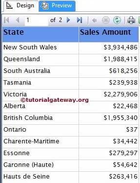
In this article we will show you, How to create and configure the Data Bars in SQL Server Reporting Services 2014. For this, We are going to use below shown report. Please refer SSRS Table Report, Data Source and Dataset articles to understand the creation of Data Source, Dataset and Table report. If you observe the below screenshot, It was a normal Table report with State Name and Sales Amount columns.
SQL Command we used as the Dataset is:
1
2
3
4
5
6
7
8
9
10
11
12
13
14
|
SELECT Geo.EnglishCountryRegionName AS Country,
Geo.StateProvinceName AS State,
SUM(Cust.YearlyIncome) AS YearlyIncome,
SUM(Fact.SalesAmount) AS SalesAmount
FROM DimCustomer AS Cust
INNER JOIN
FactInternetSales AS Fact ON
Cust.CustomerKey = Fact.CustomerKey
INNER JOIN
DimGeography AS Geo ON
Cust.GeographyKey = Geo.GeographyKey
GROUP BY Geo.EnglishCountryRegionName,
Geo.StateProvinceName
ORDER BY Country
|
Creating Data Bars in SSRS 2014
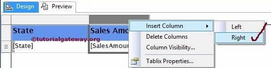
In this example, We will create and add the Data Bar on the right hand side of the Sales Amount. First, Let us create an Empty column by right clicking on the Sales Amount column and select the Insert Column option and then select Right option as shown below.
Now, Drag and drop the Drop the Data Bars from Toolbox to Empty column. When you drag and Drop the Data Bars from Toolbox to Empty column, a new window called Select Data Bar Type will be opened to select required Data Bar or Data Column from the available once. In this example, we are selecting Simple Data Bar as shown in below screenshot.
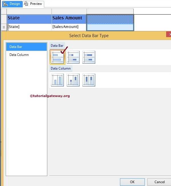
Click Ok to add Data Bar to newly created empty cell.
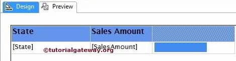
Now, we have to configure the values of a Data Bars. First, Click on the Blue bar from the below screenshot will open the Chart Data window
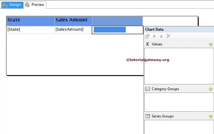
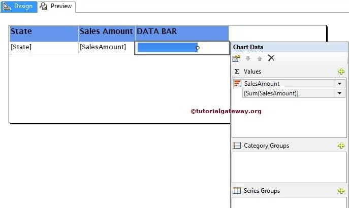
In this example, we want to show the Sales Amount in Data Bars so, Please drag and drop or select the Sales Amount as the Chart Value.
NOTE: Please be careful when dragging the columns to values region, if you mishandled or dropped in design area will end up in mess.
Click on the Preview button to see the report preview.
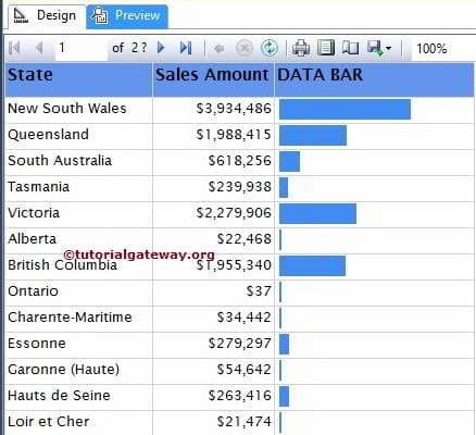
If you observe the above screenshot, It is providing perfect result but we are unable to identify the value represented by the Data Bar (Sales Amount in each state). To resolve these situations, We have to use the Data Labels.
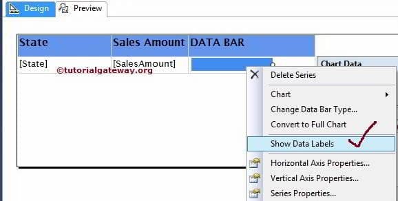
First, Right click on the Blue bars and select the Show Data Labels option from the context menu to show the values.
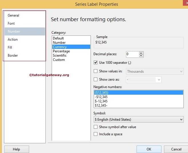
Now, Let us format the Numbers produced by the Data labels. First, right-click on the value will open the context menu as shown in below screenshot. Please select the Series Label Properties.. option from that menu

Once you click the Series Label Properties.. option, a new window will be opened to format the series labels. Here, we are changing the numbers to currency and removing the decimal values.
Click Ok to finish formatting the Data Labels. Lets click on Preview tab to see the Report preview.
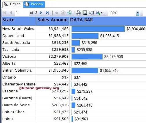
We just used the Sorting at Tablix level to sort the data by Sales Amount in Descending Order. Lets see the preview now
TIP: Please refer Data Bars in SSRS Matrix Reports to understand the configuration of Data Bars in Matrix Reports
Thank you For Visiting Our Blog
Data Bars in SSRS Matrix Reports
by suresh
In real-time, we mostly use the Data Bars in Matrix reports. In this article we will show you, How to create and configure the Data Bars in SSRS Matrix Reports.
TIP: Please refer Data Bars in SSRS 2014 article to understand the configuration of Data Bars in Table Reports with example.
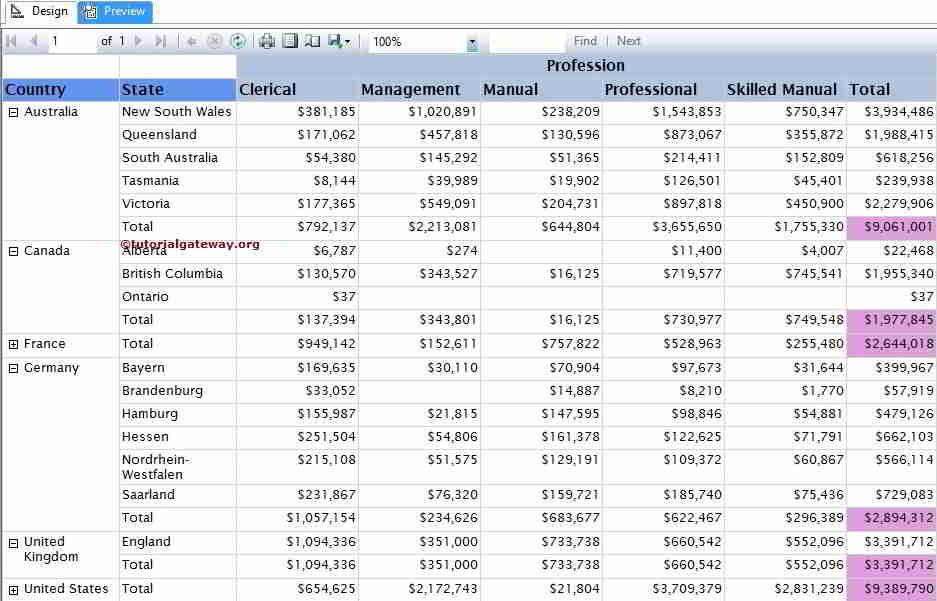
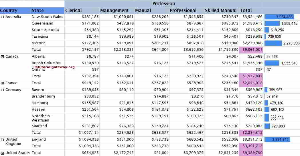
We are going to use below shown matrix report to configure the Data Bars. Please refer SSRS Matrix Report, Data Source and Dataset articles to understand the creation of Data Source, Dataset and Matrix report. If you observe the below screenshot, It was a Drill Down Matrix report with Row Total, Column Total and Grand Total (Pink Color Column) columns.
SQL Command we used as the Dataset is:
1
2
3
4
5
6
7
8
9
10
11
12
13
14
15
16
17
18
19
20
21
22
23
24
25
|
SELECT Geo.[EnglishCountryRegionName] AS [Country]
,Geo.[StateProvinceName] AS [State]
,Geo.[City]
,Cust.FirstName +' '+ Cust.LastName AS [Full Name]
,Cust.EnglishEducation AS Education
,Cust.EnglishOccupation AS Occupation
,Cust.[Gender]
,SUM(Cust.YearlyIncome) AS YearlyIncome
,SUM(Fact.SalesAmount)AS SalesAmount
FROM DimCustomer AS Cust
INNER JOIN
FactInternetSales AS Fact ON
Cust.CustomerKey = Fact.CustomerKey
INNER JOIN
[DimGeography] AS Geo ON
Cust.GeographyKey = Geo.GeographyKey
GROUP BY Geo.[EnglishCountryRegionName]
,Geo.[StateProvinceName]
,Geo.[City]
,Cust.FirstName
,Cust.LastName
,Cust.EnglishEducation
,Cust.EnglishOccupation
,[Gender]
ORDER BY [Country]
|
Creating Data bars in SSRS Matrix Report
In this example, We will create and add the Data Bar on the right hand side of the Total Column. First, Let us create an Empty column by right clicking on the Total column and select the Insert Column option and then select Right option as shown below.

Now, Drag and drop the Drop the Data Bars from Toolbox to Empty column. When you drag and Drop the Data Bars from Toolbox to Empty column, a new window called Select Data Bar Type will be opened to select required Data Bar or Data Column from the available once. In this example, we are selecting Simple Data Bar as shown in below screenshot.
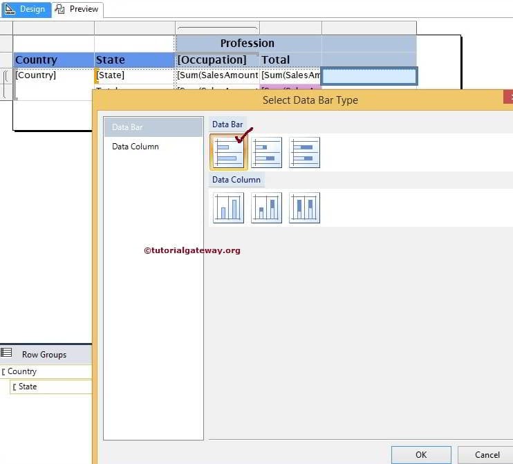
NOTE: Please be careful while adding Data Bars in Matrix Report. If you place the Data Bars at Total Row then Reporting Server will display the data bar for Totals not for States.
Click Ok to add Data Bar to newly created empty cell. Now, we have to configure the values of a Data Bars. First, Click on the Blue bar from the below screenshot will open the Chart Data window. In this example, we want to show the Sales Amount in Data Bars so, Please drag and drop or select the Sales Amount as the Chart Value.
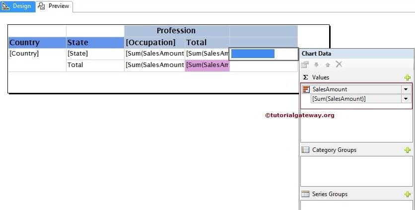
NOTE: Please be careful when dragging the columns to values region, if you mishandled or dropped in design area will end up in mess.
Click on the Preview button to see the report preview.
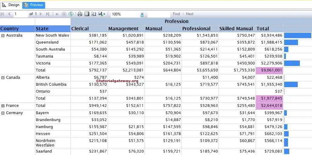
If you observe the above screenshot, It is providing perfect result but we are unable to identify the value represented by the Data Bar (Sales Amount in each state). To resolve these situations, We have to use the Data Labels.
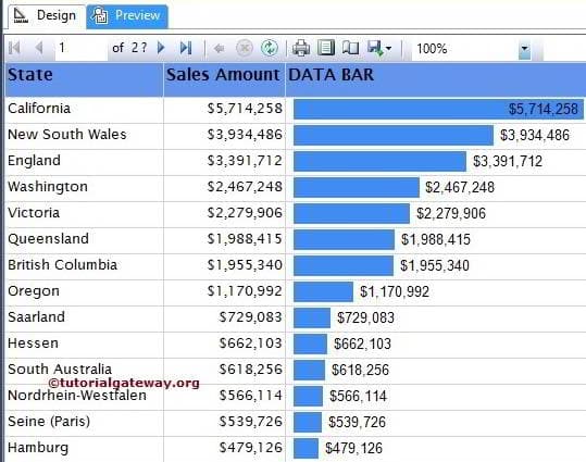
First, Right click on the Blue bars and select the Show Data Labels option from the context menu to show the values.
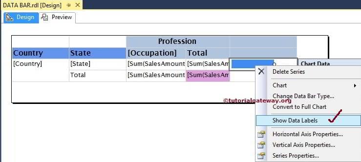
Here, we Formatted the Numbers produced by the Data labels. Lets click on Preview tab to see the Report preview.
Thank you For Visiting Our Blog
Formatting Data Bars in SSRS 2014
by suresh
In this article we will show you, How to change the Data Bar Colors, Custom colors, changing the Data Bar type and converting the Data bar to full chart in SQL Server Reporting Services 2014 with example.
To explain the available Format options, We are going to use below shown report. Please refer SSRS Data Bars article to understand the Data Source and Dataset we used for this report.
Formatting the Data Bar Color in SSRS 2014
We normally change the data bar color using some conditions. For instance, if the sales amount is less than threshold point then Red color or something like that.
To Format the data bar color, Right click on the Blue bars and select the Series properties… option from the context menu.

Once you click on the Series properties… option, a new window will be opened with lot of properties. Here, we can change the visibility, Border colors, Shadow effects and Actions as well. In this example, we will change the color of the data bars using the condition so, Goto Fill tab and click on the fx button
TIP: If you want to change the color without any condition then just select the color from the drop down list.

Once you click on the fx button, a new Expression window will be opened to write the custom expression for the color. We are going to use below expression.
Expression:
1
2
3
4
|
=IIF(
Sum(Fields!SalesAmount.Value) > 1000000, "Green",
IIF(Sum(Fields!SalesAmount.Value) > 100000, "Blue","Red")
)
|
Analysis:
- If the Sum of Sales Amount is greater than 1000000 then Data Bar will be filled with Green color
- If the Sum of Sales Amount is greater than 100000 then Data Bar will be filled with Blue color
- Otherwise Red color

Click Ok to finish assigning colors. Click the preview button and see the Report preview

From the above screenshot you can observe that, Report is generating three different colors based on the given expression.
Formatting Horizontal & Vertical Axis Properties
Right click on the Blue bars will open the context menu. From the menu, please selectHorizontal Axis Properties option as we shown in below screenshot

Once you select the Horizontal Axis Properties option, a new window called Horizontal Axis Properties to configure the range and Scale options as per company requirements.

If you want to format the vertical Axis properties then, select the Vertical Axis Properties option. Once you selected, a new window called Vertical Axis Properties to configure the range, margins and Scale options as per company requirements.

Change Data Bar Type in SSRS 2014
SSRS allows us to change the Data bar type even after creating the Data Bar. First, select the Data Bar and right-click on it will open the context menu. Please select the Change Data Bar Type… option from the context menu

Once you select the Change Data Bar Type… option, it will open new window to select the new Data Bar or data Column. Here we are selecting simple Data Column as shown below

Click Ok to finish and preview the report

Converting Data Bar to Full Chart in SSRS 2014
SSRS allows us to convert the Data Bar to Chart. First, select the Data Bar and right-click on it will open the context menu. Please select the Convert to Full Chart option from the context menu

Once you select the Convert to Full Chart option, Data Bar will be replaced by the Column Chart with Vertical and Horizontal Axis as shown in below screenshot

Here, We removed the Axis Titles, Chart Title, Legend Title and formatted the Numeric values as well.

Let us click on preview to preview the Data bar report

Thank You for Visiting Our Blog