Column charts are good for comparisons. By seeing the Column Chart one can understand the business without any further concerns. For example, compare product Sales of this year and previous year and performance of an employee, customer orders compared to last year or last month or last week etc. In this article we will show you, How to create and configure the Column charts in SQL Server Reporting Services 2014
Below screenshot will show you the, Data Source and Dataset we used for this Pie Chart Report.
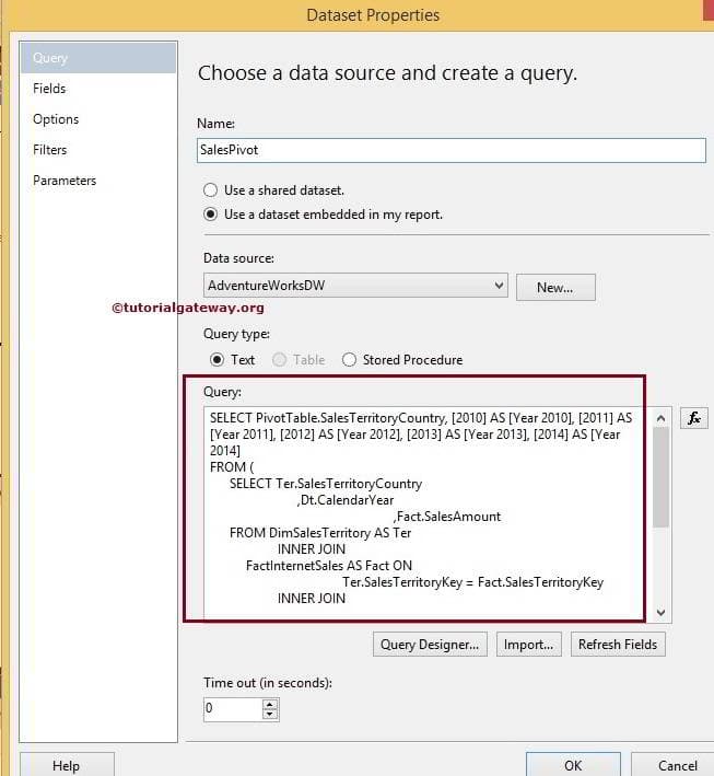
SQL Command we used in the above screenshot is:
T-SQL QUERY
Creating Column Charts in SSRS 2014
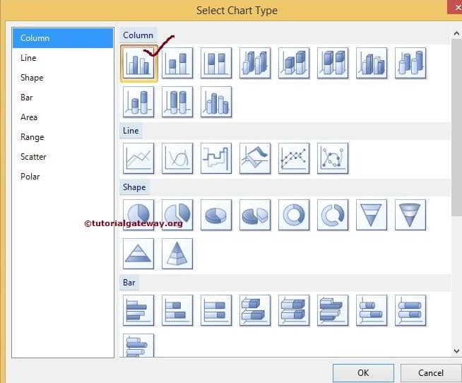
When you drag and Drop the Chart from Toolbox to Design space, a new window calledSelect Chart Type will be opened to select required chart from the available once. In this example, we are selecting Simple Column Chart as shown in below screenshot.
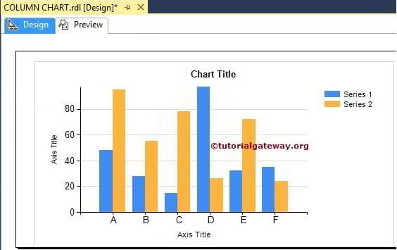
Once you click on Ok button, Column chart will be displayed in design region with dummy data.
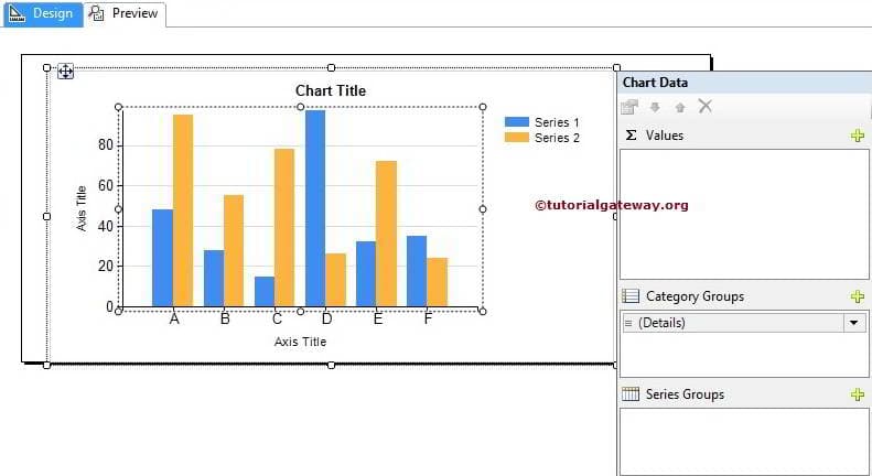
Click on the empty space around the Column Chart will open the Chart Data window
- Values: Any Numeric (Metric) value such as sales amount, Tax, Total Sales, Customer count etc. All these values will be aggregated using aggregate function (Sum, Count etc) because we are grouping them with the category group items.
- Category Group: Please specify the Column name on which you want to partition you Column Chart.
In this example, we will create Column chart for Year 2011 and 2012 Sales by country so, Drag and drop the Year 2011 and 2012 column from dataset to chart data values and Country Name in category group.
NOTE: Please be careful when dragging the columns to values region, if you mishandled or dropped in design area will end up in mess.

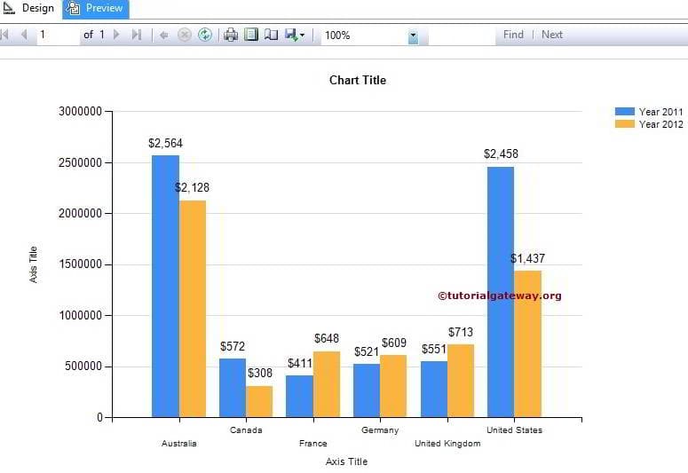
Click on the Preview button to see the report preview.

If you observe the above screenshot, It is providing perfect result but we are unable to identify the amount of Sales in each country. To resolve these situations, We have to use theData Labels.
First, Right click on the Blue bars (representing 2011 Year) and select the Show Data Labelsoption from the context menu to show the values.
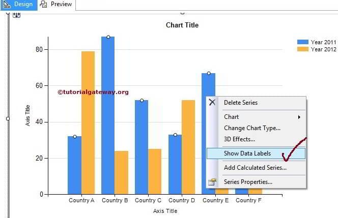
Second, Right click on the Yellow bars (representing 2012 Year) and select the Show Data Labels option from the context menu to show the values.
Click on the Preview button to see the report preview.
Thank you For Visiting Our Blog
Formatting Column Chart in SSRS 2014
In this article we will show you, How to change the Column Chart Title, Legend Title, Legend Position, Column Chart Font, Column Chart Model, Column Chart Type. We will also explain, How to Display Percentage Values as Labels on Column Chart and Calculating the Average of Column Chart in SQL Server Reporting Services 2014 with example.
To explain the available Format options, We are going to use below shown report. Please refer SSRS Column Chart article to understand the Data Source and Dataset we used for this report.
Change Column Chart Title in SSRS 2014
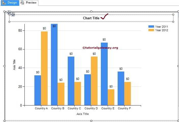
To change the Column Chart title, Please select the Chart title region as we shown in below screenshot
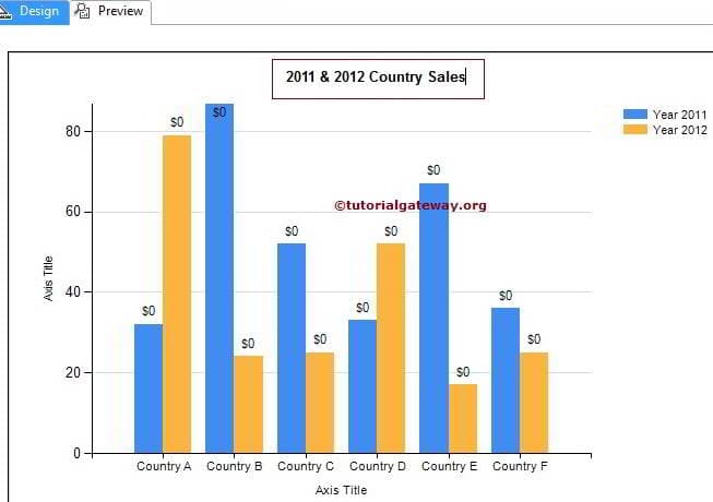
Now, change the title as per your requirement. Here we changed as 2011 & 2012 Country Sales because the report is displaying the same
Format Font and Legend Position of a Column Chart in SSRS 2014
Select the Legend region and right-click on it will open the context menu. From the menu, please select Legend Properties option as we shown in below screenshot
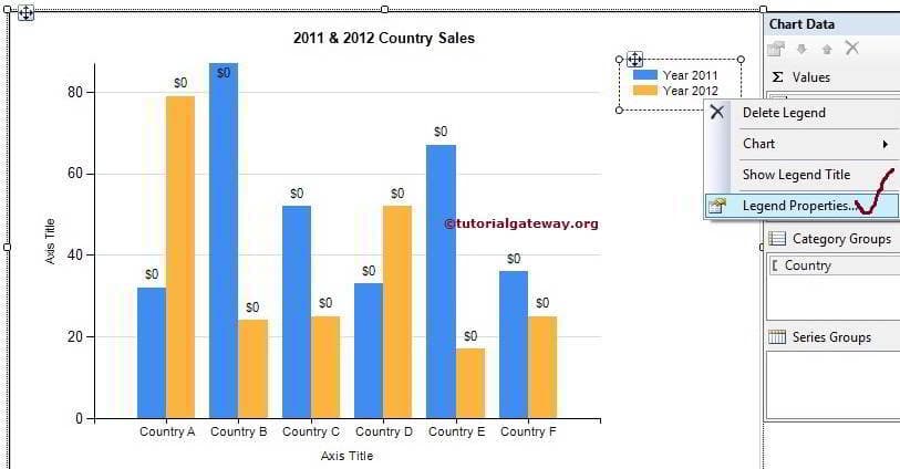
TIP: To display the Column Chart Legend title, Please select the Show Legend Title option from the above screenshot
Within the General Tab we have an option called Legend Position as shown in below screenshot. You can change the Legend Position by select those dot positions

Next, We can change the Font Size, Font Family, Font Style and Color of a Column Chart Legend using Font Tab so on.
Change the Axis Titles in SSRS Column Chart
Select the Axis Title region and right-click on it will open the context menu. From the menu, please select Axis Title Properties option as we shown in below screenshot
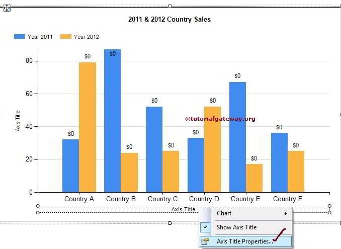
Once you select the Axis Title Properties option, a new window called Axis Title Properties to configure the Title Text, font etc. For now, we are changing the title text as Countries and alignment as Center

Next, We can change the Font Size, Font Family, Font Style and Color of a Column Chart Axis using Font Tab. Please change the Vertical Axis title also.
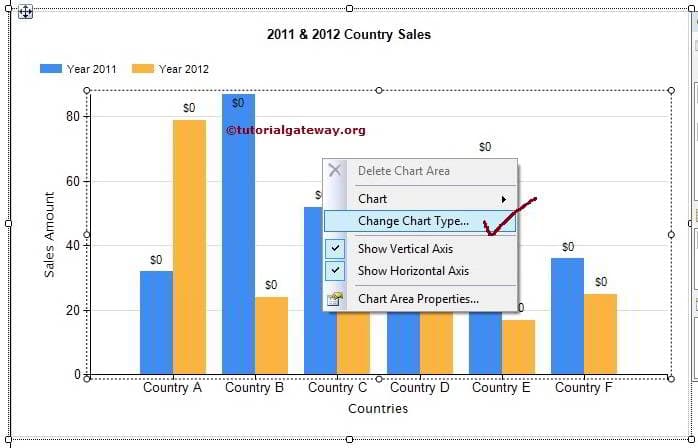
Change the Column Chart in SSRS 2014
SSRS allows us to change the chart type even after creating the chart. First, select the Column chart and right-click on it will open the context menu. Please select the Change Chart Type… option from the context menu
Once you select the Change Chart Type… option, it will open new window to select the new chart. Here we are select 3D Column chart
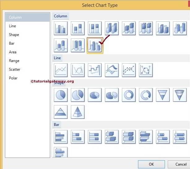
Click Ok to finish
Formatting Horizontal and Vertical Axis in SSRS Column Chart
Select the Horizontal Axis region and right-click on it will open the context menu. From the menu, please select Horizontal Axis Properties option as we shown in below screenshot
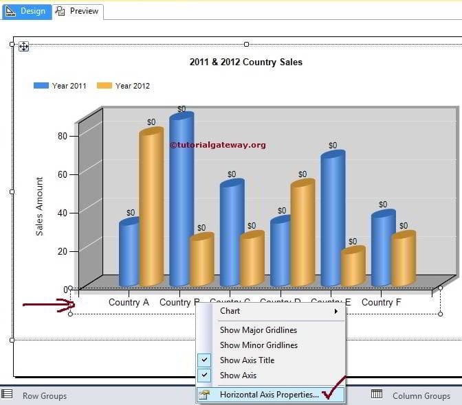
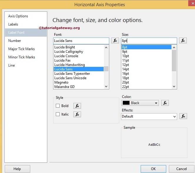
Once you select the Horizontal Axis Properties option it will open new window to format the properties. Here we are changing the select Label fonts. You can try others as well
Now, select the Vertical Axis and go to the Vertical Axis Properties option to configure them. Here, We formatted the Numeric values by changing them to currency

Click Ok button and preview the report

From the above screenshot you can observe that, We successfully changed and formatted the Column Chart
Display Percentage Values as Labels on Column Chart in SSRS 2014
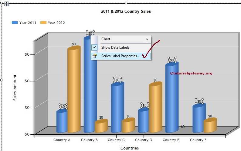
First select the data labels of a Year 2011 on the Column Chart and then right-click on them will open the context menu. Please select the Series Label properties… option from the context menu
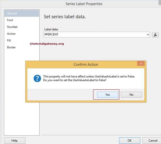
Within the General Tab, Please select the Label data to #PERCENT from the drop down list. Once you select the percent a pop up window will be displayed asking, Do you want to setUseValueAsLable to false or not. Please select Yes because we are changing the default value to percent
Click Ok to finish configuring percentage values for Year 2011. Now, Repeat the same process for Year 2012

We successfully displayed the Percentages as Column Chart Label
Calculating the Average of a Column Chart in SSRS 2014
First select the data labels of a Year 2011 on the Column Chart and then right-click on them will open the context menu. Please select the Add Calculated Series… option from the context menu
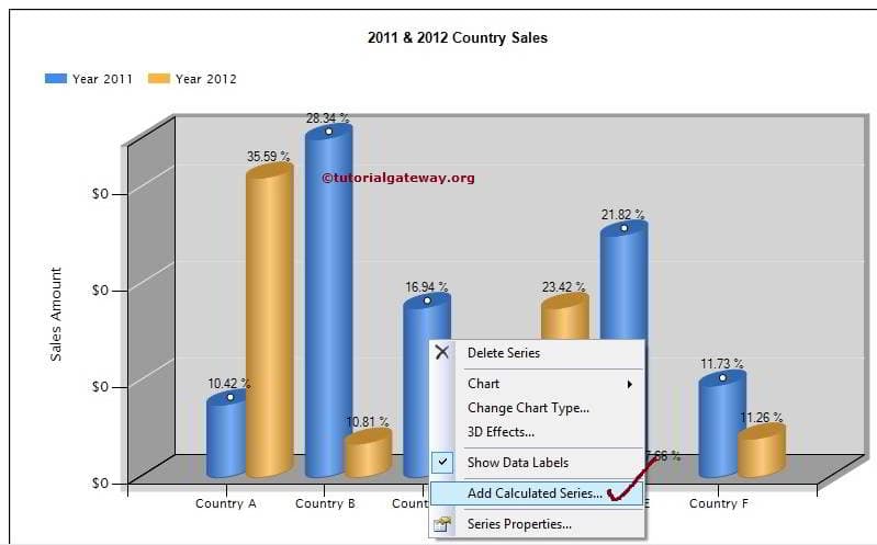
Once you select the Add Calculated Series… option it will open new window called Calculated Series Properties. Here we are going to calculate the Mean so select Mean from the drop down list as shown below. You can try others as well

Click Ok to finish calculating the Average for Year 2011. Now, Repeat the same process for Year 2012
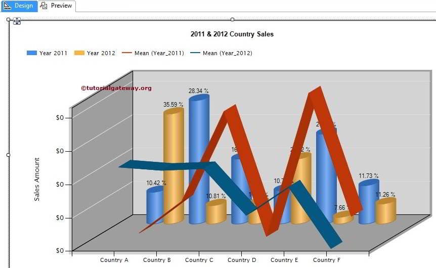
Click on the preview button to preview the SSRS Column Report

Thank You for Visiting Our Blog